I recently came across a type of plotting technique called bump chart and found it compelling. It is a type of line plot that can be used to visualize time series data. Its a more cleaner visualization compared to line plots as it make comparing position or performance of multiple observations much easier. When I was researching on how to plot this type of chart, I only came across methods done with api's such as tablaeu, but couldn't find a pure python implementation. So I wanted to write a pythonic function that can plot a bump chart from given dataframe. This is a short learning and fun project.
Data
So we need some kind of tabular time series data to plot this function. I decided to download the google trends data from their search api for cities that searched the word 'Data Science' the most to keep the theme going. I downloaded data from 2015 - 2020. Now let's look at the visualization.
Inference
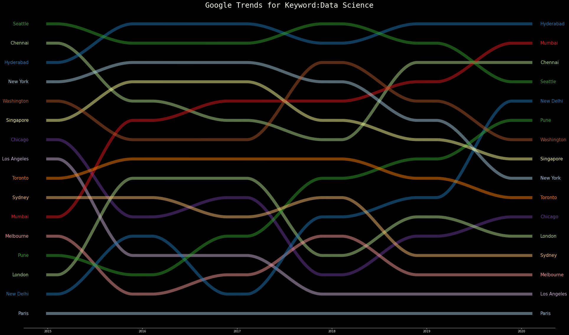
Lets try to infer what's being shown in the image. The X axis are the most popular cities relative to the full data. In total there were 103 cities, but plotting them became too cluttered as most of them contained Nan values. After cleaning, with a total of 15 cities from around the world we get this plot. The cities here range from extremely large ones like New York or New Delhi to moderate ones like Pune or Seattle. One thing that is common is that all cities have high populatio of >2.5M people. So there is a large search volume. One nice thing to infer is that most Indian cities have a rise in popularity for data science since 2015, while western cities are either stagnated or the search volume dropped. Polar opposites would be Mumbai and Chicago, while the most stable ones are Paris and Toronto. But one has to note that this is only English data, so most European and Latin America does not appear in this data and also doesn't include other major contributors to data science like China and Japan where google is not popular. But the purpose of this project was to learn and implement the bump chart which was successful and looks more nicer than the average line plots. On a more complicated data with hundered of data points this would much useful to understand the data. Thanks for reading. If you like it please visit my github for the implementation code.